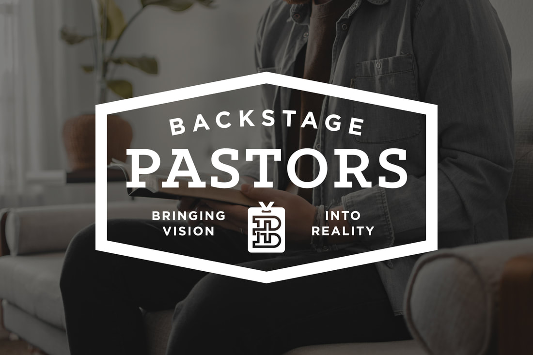
Logo CASE STUDY - BACKSTAGE PASTORS
Update June 2024:
The Backstage Pastors brand identity won an Award of Excellence in the Best Brand Awards 2024 competition. Best Brand Awards is a highly competitive branding competition in its 10th year with an international jury of experts in the field.
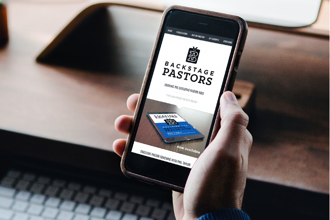
Backstage Pastors is an organization that resources and supports Executive Pastors with training content, coaching and books. My good friend, Phil Taylor, author of two books on the subject, Defining the Executive Pastor Role and Eldership Development reached out to me for a rebrand that would be utilized for his website, future books, potential future podcast and other communication material.
During my Brand Discovery process, I learned that Phil started Backstage Pastors partly because there aren't a lot of resources out there for Executive Pastors, whose ministry primarily happens offstage and behind the scenes. The target audience is goal-oriented, high-capacity, organized, and hard-working. Operating out of the spotlight, they are the backbone of many churches, bringing significant value, expertise, and leadership.
For the logo mark, we discussed visual direction relating to a backstage pass, a cross, a cast shadow, books/bible, or the letter B. The brand Identity needed to feel bold, classic, and steady. Authentically aligning with the key demographic, the rebrand should evoke feelings of trustworthiness, dependability, and experience.
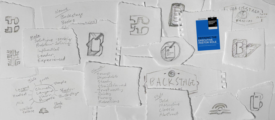
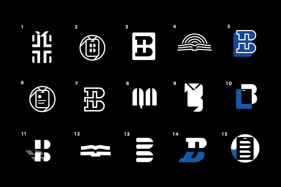
My first steps of any project are word-mapping different ideas from the brief and the brand discovery process. I spend some time researching and gathering inspiration on the branding landscape of the particular market, then start sketching a bunch of quick ideas playing around with shapes and compositions to see what's working. Next I choose a few favorites and bring them into illustrator to vectorize them with more precision.
On this project, my direction was mostly utilizing the shapes of the letter B, a cross, and a backstage pass lanyard. On some of the concepts, I also explored the idea of a cast shadow in the negative space to communicate that the Executive Pastor role is often out of the spotlight, but nevertheless has far-reaching influence, touching many things.
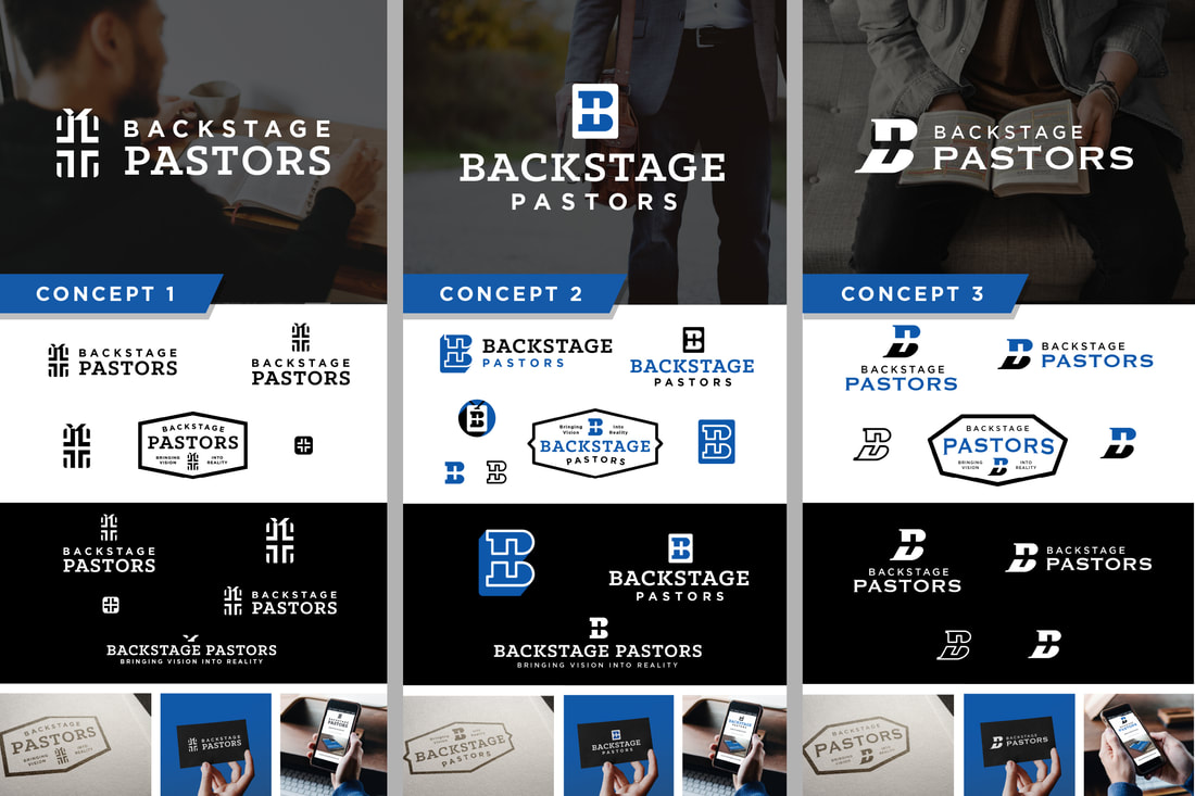
After working through a lot of quick logo mark options and building lockups with complimentary typography and color palettes, I presented 3 initial concepts to Phil. Each concept was presented showing a variety of lockups, color ways and photo mockups so that the client gets a full picture of what the logo might look like in the real world, in a variety of settings.
After the first round of initial concepts, Phil gave feedback on the 3 options. He liked concept 1 the best, but wanted to see a little bit of a tweak to the mark itself. He liked the cross that is formed in the negative space, and the concept of the backstage pass, but felt that the backstage pass shape needed to be a little more obvious. He shared that the "B" in concept 2 also felt like a win and gave me a lot of flexibility to run with that feedback however felt right to me.
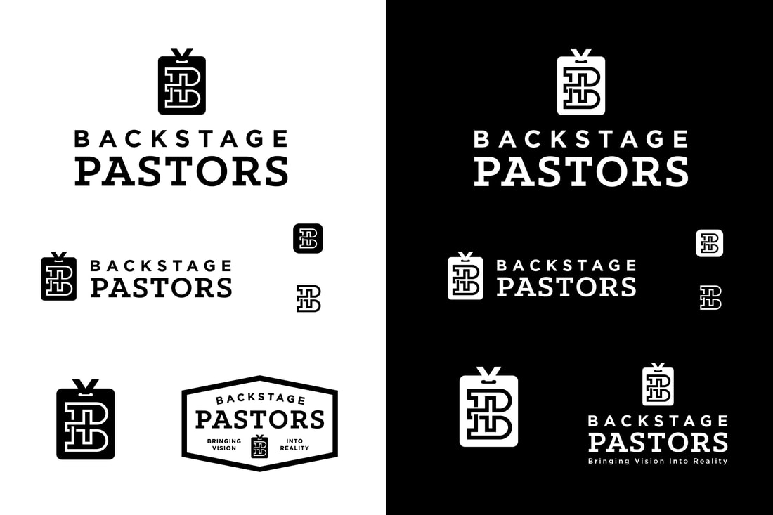
I played around a little more with the logo mark to make sure the shape of the lanyard tag was more obvious. I also revived an earlier exploration of the B + cross shape that I had always loved. Pairing an even stronger backstage pass with that slightly more unique letter B seemed to be the perfect mix of uniqueness, clarity and balance. It just sits nicely with a mix of timeless sans serif and slab serif typefaces. I presented the round 2 concept to the client and he agreed that we hit the nail on the head and no more revisions were needed. This project scope actually included a second revision if desired, but Phil felt that no further tweaks needed to be made so we packaged it up and delivered the final files on this one with pride.
FINAL LOGO DESIGN
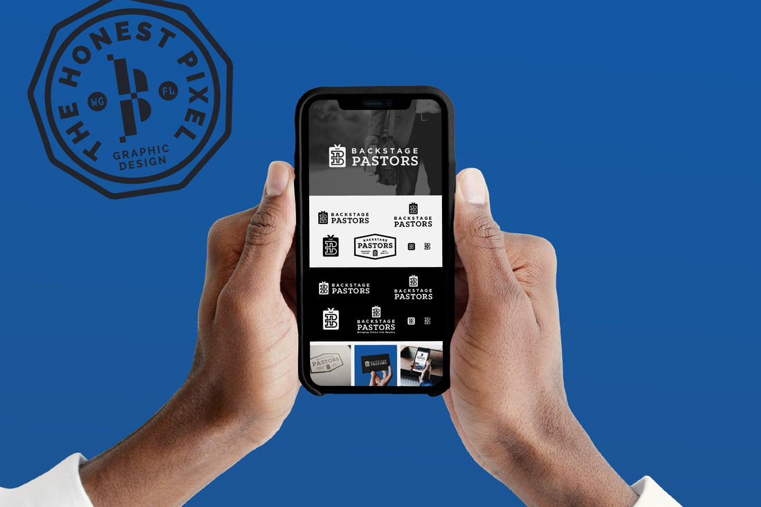
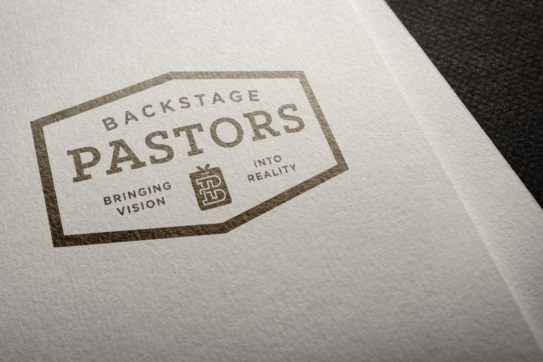
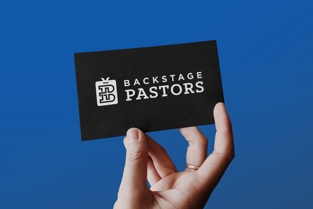
The final brand identity package features a strong and unique brand mark that artfully blends the shapes of a backstage pass, the letter B and a cross with a clean and confident brand color palette of black, white and blue. Crafted with timelessness in mind, typefaces Gotham and Klinic Slab feel traditional yet modern. The slab serif typeface adds a touch of strength and masculinity, while still feeling classic. This cohesive and responsive set of logo lockups, favicons, badge alternatives, and pattern create a robust package of assets that are authentic to the DNA of this purpose-driven, dependable brand.

