Logo CASE STUDY - MAX BLOODWELL
Update January 2024:
The Max Bloodwell and the Pop Rocks logo was Featured in Design Rush, a popular graphic design publication.
Max Bloodwell and the Pop Rocks is a 70s, 80s & 90s cover band from Orlando, FL. One of their members, Abraham Couch, is a bandmate and longtime friend of my husband’s. I’ve designed a logo and some cover art for a few singles released by the band Abe and my husband are in together, so he reached out to me to design a logo for his new band as well. When I started the project, they were still deciding between naming the band Max Bloodwell and the… Pop Rocks, Pizza Parties, or Mixtapes. The band wanted the logo to have a retro feel and referenced the stripes on a VHS cover as inspiration. They had one piece of design that they had used for a quick poster with some stripes in the corner over a photo. Being friends with a few of the band members, I knew the vibe needed to be fun, vintage, and approachable. So, I went to work collecting ideas, sketching, and developing concepts that would bring the vision to life.
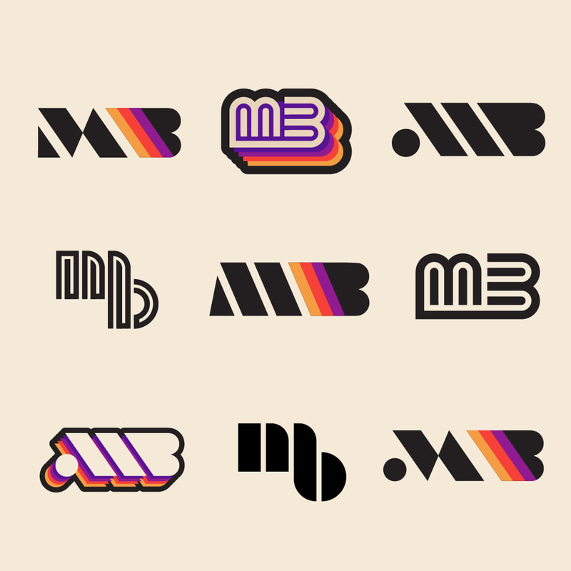
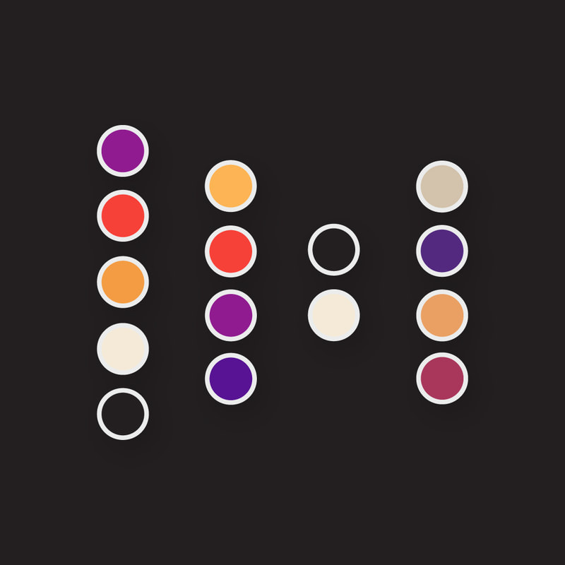
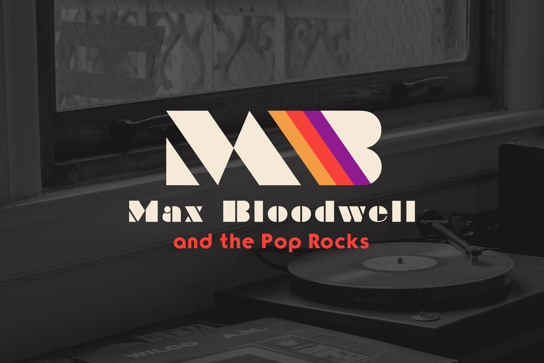
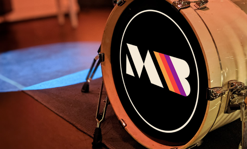
For the logomark, I saw tons of potential in using a monogram of the letters “MB” with retro stripes of warm pops of color and sepia tones. The combination of soft neutrals and stripes of saturated colors gives the logo a nostalgic and fun vibe.
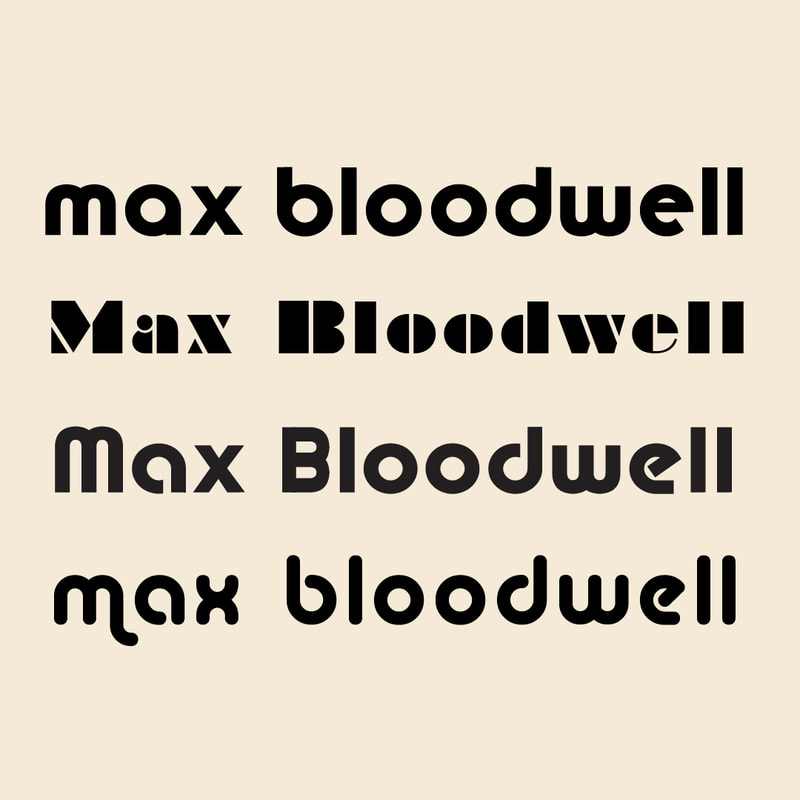
I explored a variety of heavy to mid-weight, retro, display fonts. Some more rounded and clean options paired well with the more fluid logomark concepts, while the heavier stencil fonts paired well with the more chunky, geometric logomark concepts.
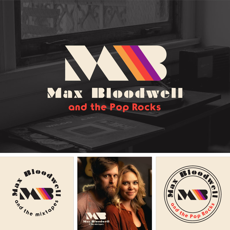
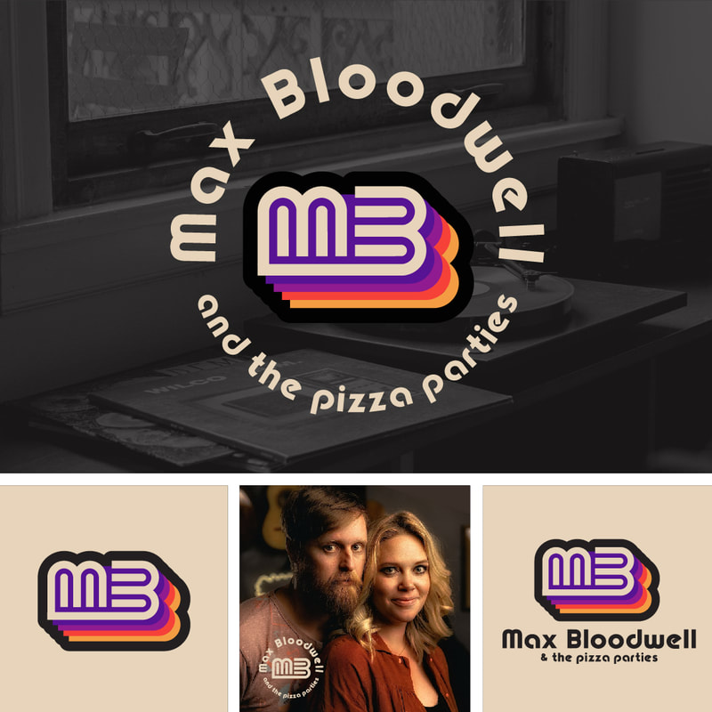
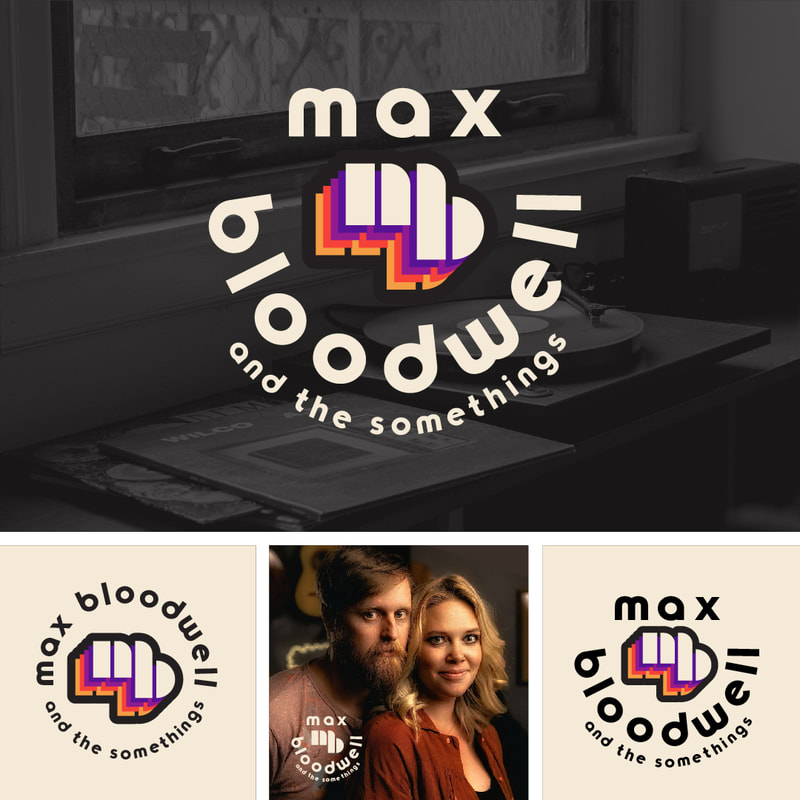
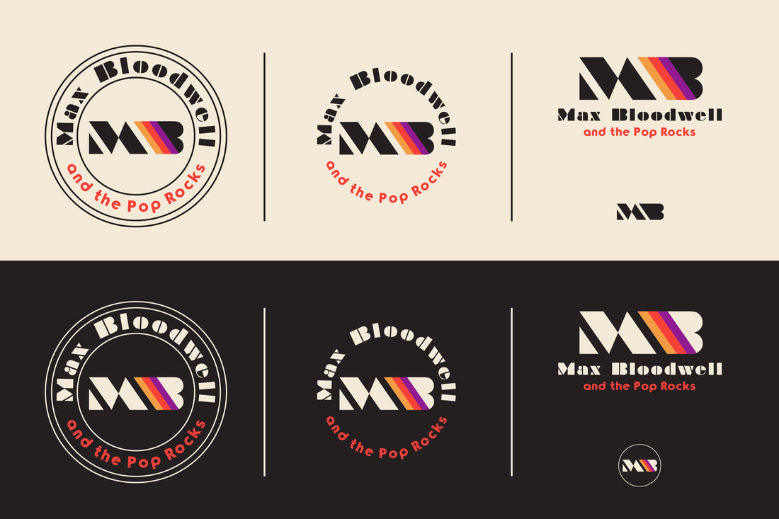
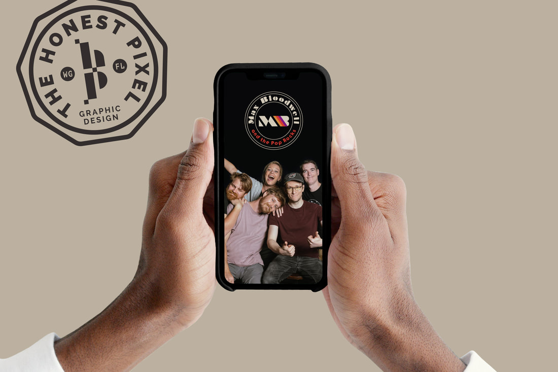
In the first round, the client was able to provide feedback on 3 initial concepts. I presented these concepts with a variety of responsive lockups and photo mock-ups to help them visualize what the logo will look like in the real world, in different applications.
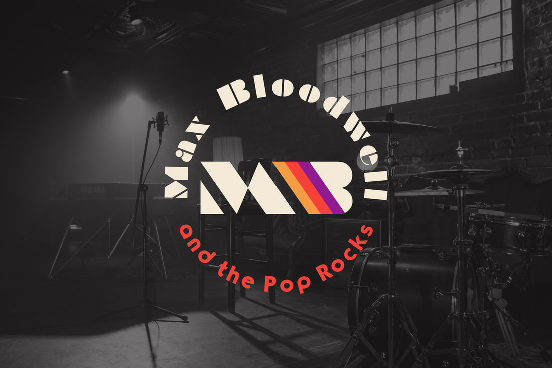
Abraham and his bandmates loved option 1 and requested very minor revisions, like adding a little more color to the typography (which was all one color during round 1). I presented a couple of options for different typography colors, and they loved how it looked keeping “Max Bloodwell” neutral and just adding a pop of red to “and the Pop Rocks”.
FINAL LOGO DESIGN
The Max Bloodwell and the Pop Rocks logo is sharp, fun and colorful, evoking all the nostalgic feelings of sliding an old vinyl record out of its worn and yellowed sleeve. The satisfying and balanced lines of the “MB” monogram pair perfectly with the colorful stripes sitting on a palette of cream and charcoal. The typefaces of Braggadocio and TypoGraphic convey just the right amount of wistfulness for yesteryear.

